Creating an application that meets the accessibility standards is tough, but we don’t have a choice anymore. It is our responsibility to make sure our products can be used by all users, not just morally, but often legally as well. Considering accessibility as part of your design system is a good starting point. How? Read on!
16% of the world’s population experience some form of disability, according to the World Health Organization (March 2023). This number grows every day as the global population ages. A lot of these people need to use assistive technology to navigate websites and other digital products and experience a clear mismatch between how they use their tools and how interfaces are designed. Recent studies found that less than 2% of homepages meet standard level AA WCAG 2.x accessibility requirements, which is the general standard of web accessibility.
Assistive technology comes in many shapes and forms: screen readers that read an interface out aloud, zoom software that enlarges elements, or simply using only a keyboard to navigate instead of a mouse. The reasons for using them also vary wildly, ranging from efficiency or personal preference to mobility disabilities.
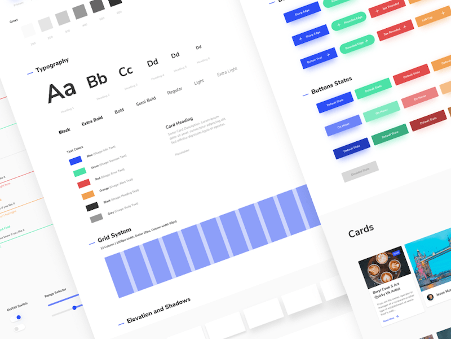
Design systems are the perfect opportunity to build accessibility and inclusion into your component libraries, both from a code repository perspective as well as from a UI/UX design perspective. Seeing accessibility as an integrated part of the process, rather than ‘something that we need to check’ when the project is at its end, is something that we’re seeing more and more of nowadays.

Incorporating accessibility starts at the component level
When you want to incorporate accessibility into design systems there are two major considerations: usability and compatibility. We need to be able to provide for both in a design system.
Usability is not only the experience you have when you operate an interface to get a task done, but it’s also the flow of the application, and how you navigate and understand it as a user. Compatibility has to do with how the assistive tools interact with the interfaces and systems. This is outside the control of the users and can be limited by the operating system and/or the type of assistive tools they use. Usability and compatibility play out at several levels of the design system, but it all starts at the individual component level.

However, it’s crucial to keep in mind that if individual components may have built-in accessibility, it doesn’t necessarily mean the user flows at the page level will be accessible. Designers and developers need to consider how components fit into layouts. Having a clear navigation structure and using semantic code helps, but it’s also important for designers and developers to have more context for when they use components. For example, if you have a set of forms, you need to have instructions about the descriptive header for each form. You need to have criteria related to the context you’re using the component in.
Testing and tools ensure success
To ensure that components and page-level flows are accessible, you’ll need to test them. There are three main ways of testing your work. First, you should do manual testing while you’re in the process of creating or developing components. Second, use automated testing, and third, which arguably is the most important, is testing with users.
There are several tools that designers and developers can use during their work for quick testing. Here are a few ways that enable designers to test while designing:
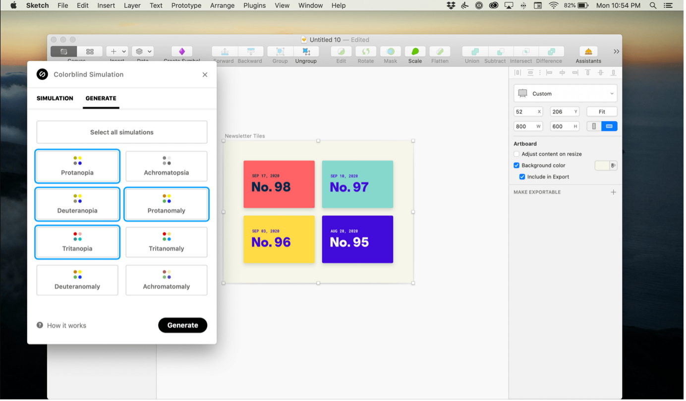
• A colorblindness plugin for Sketch, Figma, and XD: Stark
• A colorblindness tool for Windows, Mac, or Linux: Color Oracle
• Online contrast check for colors: Contrastchecker.com or WebAIM
• Generate a color palette according to text style and background-color: Colorsafe

Developers can manually test by doing QA and do code reviews to check the accessibility of a design system component or page template. For designers, there is also a chrome extension called Funkify which simulates certain imparities like dyslexia, visual impairment, and cognition, etc.
For designers & developers, there is a chrome extension that automatically checks base level accessibility issues called the aXe plugin which will often find hierarchy issues. There is also a plugin called Accessibility Insights for Web that helps you run a checklist of all the accessibility rules.
You may also use the WAVE, a tool from WebAIM that scans websites and lists any violations it finds.
There is also a Google tool called Lighthouse, which is an automated tool to improve webpages, including accessibility issues.
Automated checkers are one way of assessing accessibility, but it’s important to consider that you will need to do testing with real people to understand whether an implementation is accessible to a particular user and their (assistive technology) needs.
Education is key
Making an accessible design system requires a thorough understanding of accessibility within the design system team and, ideally, awareness in the (digital) organization that you’re a part of.
I have personally faced the challenges of being the single “accessibility expert” at a company. In short: it doesn’t work. Everyone that works on building digital products impacts accessibility, from developer to manager. Knowing that your actions and decisions can limit someone during their online experience is key, so in other words, if you’re the lone expert on accessibility, you’ll need to rectify that situation. This is where education and awareness building come in as fundamental aspects of embedding an accessibility mindset into your approach.

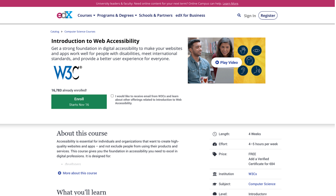
Education can be done formally or informally, but often end up being a mix of both. There are various formal ways to learn about accessibility such as W3C’s course ‘Introduction to Web Accessibility” at edX or it can be done at the International Association of Accessibility Professionals (IAAP for short). Education on accessibility is also done at an informal peer-to-peer level. At every larger company I worked for there are at least some documented guidelines, such as the color palette or typography. I noticed that working side by side with people who have deep accessibility knowledge helps me and the whole team grow.
So, it’s also a lot of ‘on-the-job’ education. For instance, when I see something going wrong, I’ll call it out and we’ll make sure the mistakes are fixed and we’ll make sure doesn’t happen again by adding the correct way to our way of working. That’s why design review sessions are very important.
If you aren’t willing to consider accessibility as part of your responsibility, it’s just not going to work, and quite frankly, you’re a bad designer.
How you can get started now
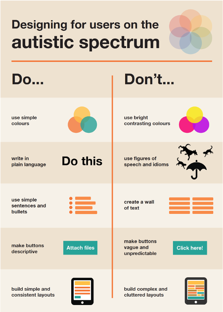
If you want to get in on accessible design, there is a very nice infographic about web accessibility for designers at WebAIM that you can use as a checklist while designing. When you’re looking for more specific do’s and don’ts, the UK Home Office made several posters about Designing for Accessibility. They have posters per type of disability such as people in the autistic spectrum, people who use screen readers, people with low vision, etc.

Accessibility isn’t optional anymore
In my eyes, accessibility shouldn’t be a separate ‘thing’ when designing. On the contrary, it should be part of the complete design process. As designers, we are in charge of the complete experience of our users, and that is including accessibility. If you aren’t willing to consider accessibility as part of your responsibility, it’s just not going to work, and quite frankly, you’re a bad designer.
Thankfully, nowadays, there is more recognition in the digital world that accessibility is essential for building successful products. A good development is that as of 28th June 2025 it becomes mandatory in the whole EU to apply accessibility rules for every business. Nonetheless, design systems are slowly becoming more often the foundational structures in digital product design and development. Therefore, we have to ensure that all of them become accessible. For everyone.


