Case study
Ministry of the Interior and Kingdom Relations

A more accessible personal portal
Our client
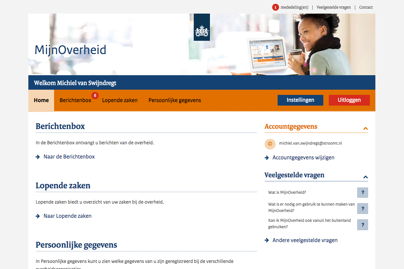
MijnOverheid (Dutch for: MyGovernment) is the government's personal portal for citizens. Here they can view personal data, receive government mail in the digital Message Box and view the status of current government affairs. This also makes it important that MijnGovernment is accessible to everyone. The Ministry of the Interior and Kingdom Relations (BZK) is responsible for MijnOverheid.
Our challenge
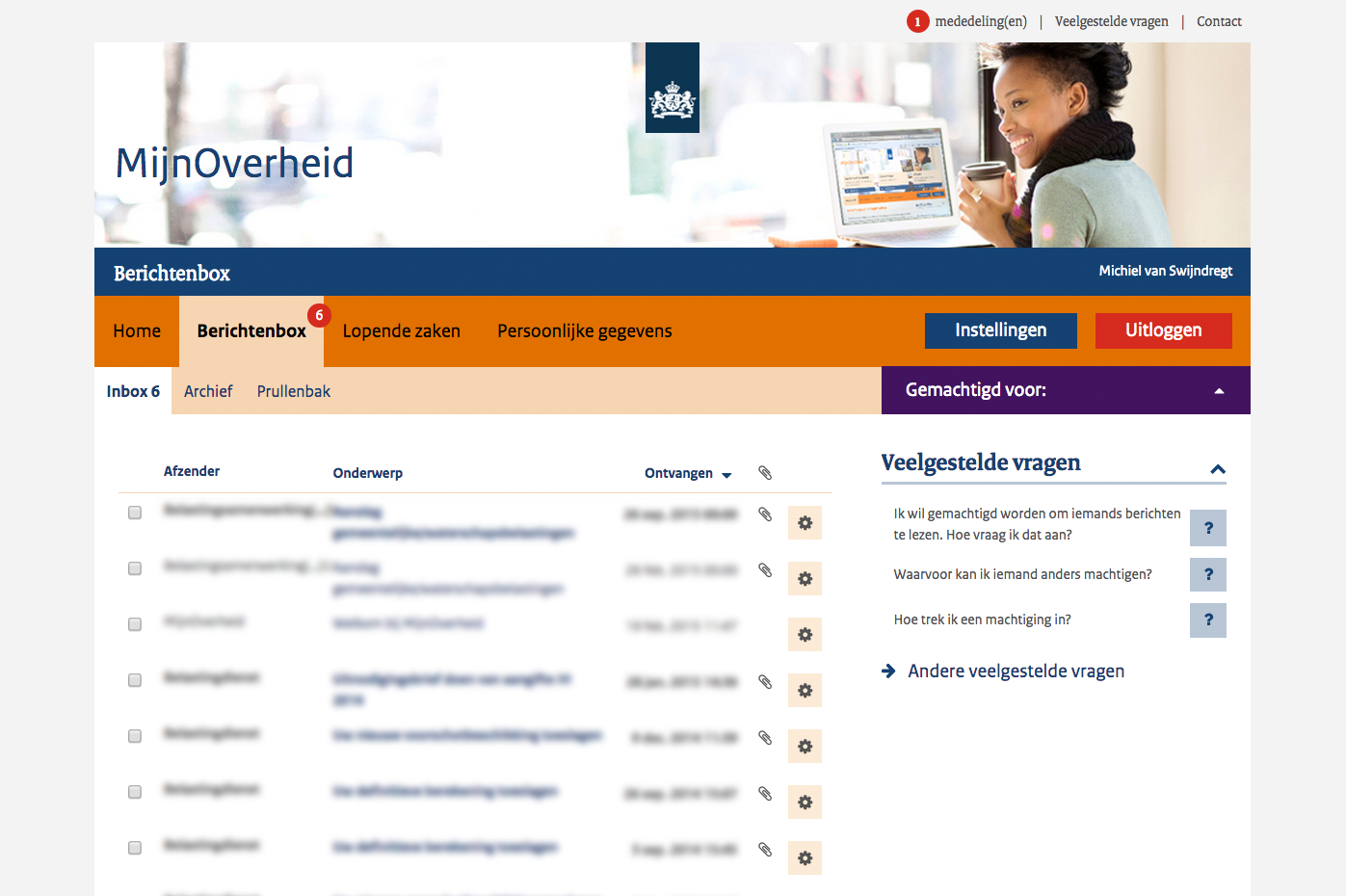
When the Ministry of the Interior approached us in 2014, they were looking for a UX person who could make the MijnOverheid website suitable for mobile and tablet (responsive). Until then, the website could only be used properly via a computer, and only very cumbersome with a mobile phone. When we started this assignment, the site consisted of 56 separate pages. Each page was about the same, but not quite. This not only made implementing changes time-consuming, but also made the visit of MijnOverheid by citizens less pleasant. That is why we looked for a solution that would work better for both citizens and administrators. In order to achieve that, it was also necessary to increase the accessibility of the site.
Our solution
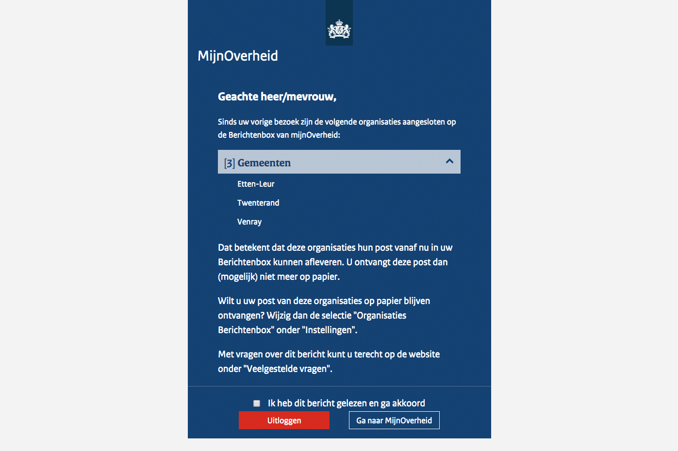
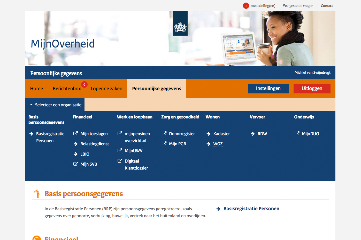
We have reduced the 56 different pages to 5 easily accessible templates. This not only ensured that only these 5 templates had to be made responsive, instead of 56 separate pages, but also increased the consistency and therefore the predictability of the site for the citizen. This way citizens know better where to go on the site when they are looking for something. We have built a Design System to make the further development of MijnGovernment easier, to keep it consistent and to implement new changes more efficiently. We also recorded the improvements to the accessibility of MijnGovernment in the Design System. In this way we ensured that the new accessibility standard was also met when making adjustments to the site.
Our approach
The goal was an accessible and intuitive site for citizens, regardless of device, that would also be easy to manage. The challenges varied, but the solution was largely the same. We first examined which of the original 56 pages had similar features. Based on this, we decided to build 5 accessible templates, and to cast all pages in one of these templates. We defined recurring elements and made them into standard components.
By building a Design System, we made it even easier to develop the website. This means that there is much less need to think about the form, and as a result, a lot more focus can be given to the content. In the Design System, all website or application elements are predefined in terms of colours, functionality and accessibility. If you want to create a new page, the development team does not have to create a new accordion menu or search field. Such functions can now be put on a page, almost like a Lego block. By taking accessibility into account when building and managing a Design System, you also ensure that new pages or versions of the site are user-friendly for everyone.
Discover more
Municipality of Woerden
A user-friendly 'upgrade'
Council of the Judiciary
A comprehensive innovation pathway

