Case study
NedGraphics

Working with developers to implement a design update that improves the user experience of NedBrowser software.
The Client
NedGraphics (a Cadac Group company) combines over 40 years of experience with geo-information technology together with document and data management. Its clients include governments, aviation and infrastructure organisations.
NedGraphics also supplies software and advises on its design.
This software allows organisations to design, manage and publish drawings and maps that can then be linked to private and public data sources.
The Challenge
To help the development team improve the user experience of NedBrowser software.
NedBrowser is a geo-viewer: an application that enables users to look up and view geographic information.
NedBrowser has a flexible management environment where the user interface can be configured to meet the needs of a diverse audience. It can also link to numerous public and private data sources.
Our Solution
After reviewing the software's learnability, operability and accessibility we tested our insights with users. Together with the customer development team we determined which components should be designed, taking account of the technical aspects of the software, the connection to other NedGraphics software and user friendliness.
The UI/UX opinions of Keen Software always add great value for NedGraphics as we don't have UI/UX expertise in house.”
Hennie Genee , Development Manager NedGraphics

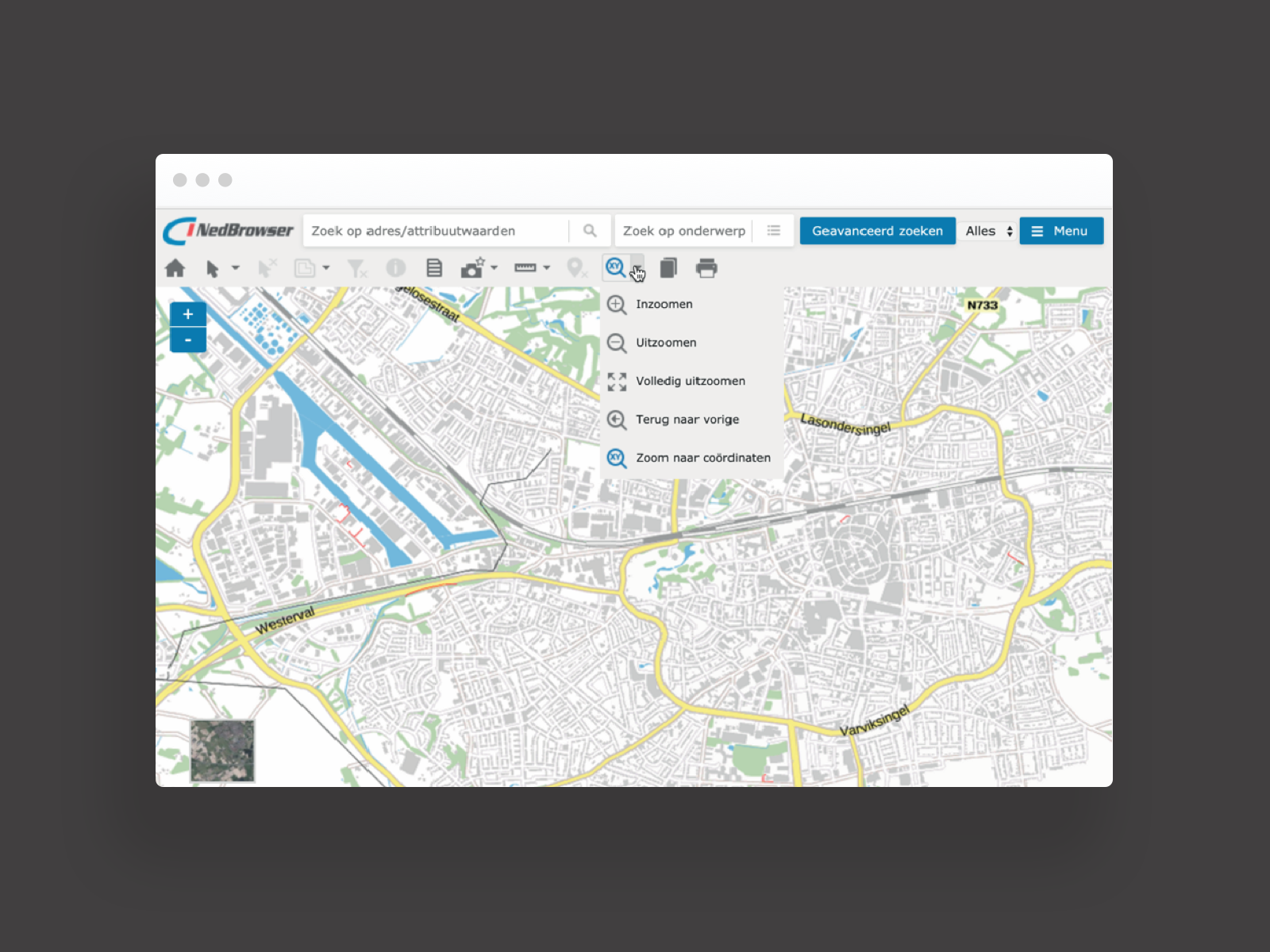
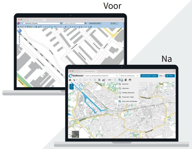
Big interface improvements on the previous version, resulting from UX research.
When designing the new components, the focus was on simplifying the toolbar and information table and making them more visually appealing.
Process
Analysis - interviews -design
Our analysis of the NedBrowser software looked at learnability, operability and accessibility. We then tested our first insights by interviewing users at two Dutch municipalities.
Together with the client we determined which components should be designed. The main factors considered were the technical aspects of the software, the connection to other NedGraphics software and its user-friendliness.
We then created wireframes and agreed the component design update with all stakeholders. The client also backed our design approach to align the visual style with other NedGraphics software.


Results
Activities
- Product Analysis
- Collect Requirements
- Interviews
- Usage tests
- Construction supervision
Deliverables
- Interaction design
- Visual design
Tools used in this project
Customer Journey Mapping
UX Concept
UX Architecture
Style Determination
UI Design
User Testing


