Case study
SURFnet

Long-term cooperation to continuallly improve and renew dashboard functionality as customer needs change and more service information becomes available.
The Client
SURF is a cooperative association of higher education and research institutions in the Netherlands.
SURF develops and offers joint services so that the 100 + members can benefit from economies of scale and do not have to reinvent the wheel.
Previously, SURFnet was the name for the internet service provider for the cooperative.
The Challenge
The self-service portal (SURFdashboard) for members uses several webservices provided by various internal IT departments.
It's where clients log in to consult information and extract reports about services.
The challenge was to continually improve and renew the SURFdashboard service taking account of all the connections to internal systems, the needs of different user groups and the corporate style.
Our Solution
For users we delivered a more intuitive dashboard that was clearer and more interactive. Over time we created various iterations of the platform: from roadmap to concept and design through to rollout to clients. The solutions delivered always took into account the technical aspects and ease-of-implementation for developers
We acted as a single point of contact for the project manager, developers and all stakeholders.
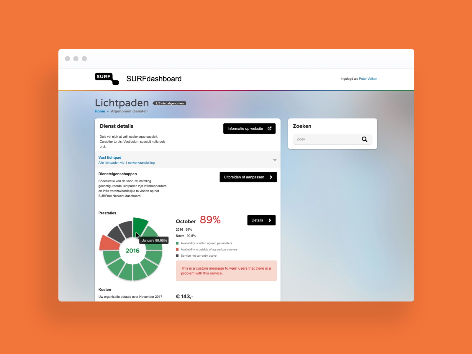
A dashboard is a living tool, so the process around it requires a lot of attention as well.
Process
The dashboard has a wide range of functions and uses several webservices provided by internal IT departments. Customers can
- Check the real-time status of the service
- Adapt and expand the service provision
- Consult SLAs and related updates
- Maintain administrative files, e.g. contact details and employee authorisations.
The design took several factors into account including the wishes of customers, internal stakeholders and technical managers. Since the service is connected to many internal systems and must also respect the SURFNet housestyle we continually consulted with all stakeholders and acted as single point of contact. This helped us to understand the context of the organisation and find solutions that fit a given situation. Our designs took account of the technical aspects and were delivered to developers ready-to-implement.

Step by step
We started in a small scrum team of developers and the product owner. To get a full picture of requirements and product scope we held one-to-one interviews with stakeholders, internal users, architects and the road manager.
The next step was to create a first screen flow draft to give a base concept of what the actual portal could be, followed by a small prototype based on the client’s design system. We presented this to multiple stakeholders.
Together with the product owner we created story mapping workshops which became the backbone of the portal. We designed easy-to-use templates for API providers to promote their APIs by focusing on their value and use. And at peak times in the project we called in extra design capabilities.
Tools used in this project
Customer Journey Mapping
UX Concept
UX Architecture
Style Determination
UI Design
User Testing

